The Best Tips On How To Mix Colors [Color Mixing Secrets]
Color mixing is a fundamental skill in art and design that allows you to create a wide range of colors by combining different hues. Whether you are a painter, graphic designer, or simply interested in learning more about colors, understanding the principles of color mixing is essential.
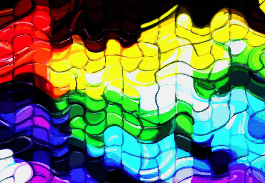
The basics of color theory serve as the foundation for successful color mixing. Primary colors, such as red, blue, and yellow, form the building blocks of all other colors. Mixing primary colors in specific proportions creates secondary colors, like orange, green, and purple. Tertiary colors are created by mixing primary and secondary colors.
The color wheel and color harmony play crucial roles in color mixing. The color wheel visually represents the relationships between colors and helps create harmonious color combinations. Understanding color properties, such as hue, value, and saturation, further enhances your ability to effectively mix colors.
Different color mixing techniques, including additive color mixing, subtractive color mixing, and tinting and shading, provide various approaches to achieve desired colors and effects. However, it's important to be aware of common color mixing mistakes to avoid, such as overmixing or using too much paint.
When mixing primary colors, specific tips can help you achieve the desired results. For example, mixing red and blue creates purple, while blending yellow and blue produces green. Combining yellow and red yields orange. These tips can be applied to create a wide range of shades and tones.
Understanding different color combinations is crucial for creating visually appealing artworks. Analogous colors, complementary colors, split complementary colors, and triadic colors offer distinct color palettes that can evoke specific moods and create visual interest.
To become proficient in color mixing, it is essential to experiment and practice regularly. By exploring different color combinations and techniques, you can develop your skills and unleash your creativity in expressing yourself through colors.
Key takeaway:
- Understanding primary, secondary, and tertiary colors is essential in color mixing.
- Utilizing the color wheel and achieving color harmony greatly enhances color mixing techniques.
- Being familiar with hue, value, and saturation aids in creating desired color shades.
The Basics of Color Theory
Discover the vibrant world of color theory as we delve into the basics of understanding and mixing colors. Unleash your creativity as we explore the power of primary colors, secondary colors, and tertiary colors.
Get ready to awe and inspire as we take a closer look at the fundamental principles behind creating harmonious color combinations. Let's dive in and unlock the secrets to mastering the art of color mixing!
Primary Colors
The primary colors, which include red, blue, and yellow, play a crucial role in the world of colors. These colors are the foundation for creating a vast spectrum of shades and tones.
Red, being a vibrant and warm color, exudes passion and energy. It effortlessly grabs attention and ignites a sense of vigor. Blue, on the other hand, is a cool color that evokes feelings of calmness and tranquility.
It instills a sense of peacefulness and serenity. Lastly, yellow is a bright and cheerful color that symbolizes happiness and positivity. It radiates joy and optimism.
Understanding the primary colors is essential for effectively mixing colors and creating various combinations. By blending different amounts of red, blue, and yellow, one can achieve an extensive range of secondary and tertiary colors. The ability to experiment with primary colors enables artists to create unique and captivating color palettes.
A fascinating fact about primary colors is their frequent utilization in card games, where visually appealing and distinguishable playing cards are created. The use of primary colors in these games allows players to easily identify suits and values on the cards, enhancing the overall gaming experience.
Secondary Colors
Secondary colors are created by mixing two primary colors together. Here is a table that shows the combinations of primary colors and the resulting secondary colors:
| Primary Color 1 | Primary Color 2 | Secondary Color |
|---|---|---|
| Red | Blue | Purple |
| Red | Yellow | Orange |
| Blue | Yellow | Green |
By mixing these primary colors, you can create a wide range of secondary colors for your artwork. Secondary colors are important in color theory as they play a significant role in creating harmonious color palettes. Artists need to understand how to mix secondary colors to expand their color vocabulary and create visually appealing compositions.
Tertiary Colors
Tertiary colors are made by mixing equal parts of primary and secondary colors. There are six tertiary colors: red-orange, yellow-orange, yellow-green, blue-green, blue-violet, and red-violet.
Red-orange is a warm color that combines the energy of red with the cheerfulness of orange. Yellow-orange is a vibrant and lively color that combines the warmth of yellow with the brightness of orange. Yellow-green is a refreshing color that combines the freshness of yellow with the calmness of green.
Blue-green is a soothing color that combines the tranquility of blue with the freshness of green. Blue-violet is a mysterious color that combines the serenity of blue with the richness of violet. Red-violet is a dramatic color that combines the intensity of red with the depth of violet.
Tertiary colors offer various possibilities for artists and designers. They add depth and complexity to color palettes and can be used to create harmonious compositions.
By understanding how tertiary colors are made and how they interact with other colors, artists can expand their creative possibilities and achieve more sophisticated results.
The Color Wheel and Color Harmony

The color wheel is a representation of the relationships between different colors, and it plays an important role in understanding color harmony. It consists of primary, secondary, and tertiary colors arranged in a circular format.
Consider the following table that illustrates the primary, secondary, and tertiary colors:
| Primary Colors | Secondary Colors | Tertiary Colors |
|---|---|---|
| Red | Orange | Red-Orange |
| Yellow | Green | Yellow-Green |
| Blue | Purple | Blue-Purple |
Color harmony refers to pleasing combinations of colors, and it can be achieved by utilizing the color wheel. There are various color harmony schemes, such as complementary, analogous, and triadic. Complementary colors create high contrast and can be found by looking at colors that are opposite each other on the color wheel.
On the other hand, analogous colors are adjacent to each other on the color wheel and create a harmonious and unified look. Triadic colors, on the other hand, are evenly spaced around the color wheel, resulting in a vibrant and balanced composition.
Understanding the concept of the color wheel and color harmony allows artists and designers to make informed decisions when mixing colors. By experimenting with different color combinations, they can create visually appealing and harmonious artwork.
Understanding Color Properties
Unveiling the intriguing world of color properties in this section! Get ready to dive into the sub-sections of hue, value, and saturation, where we'll uncover the secrets of color mixing.
From the vibrant spectrum of hues to the subtle variations in value and the intensity of saturation, we'll explore how these elements play a crucial role in creating captivating color combinations. Prepare to unlock a whole new level of understanding and mastery in the art of color mixing!
Hue
In Color Theory, hue is the purest form of a color, like red, blue, or yellow. It distinguishes one color from another on the color wheel. Hue depends on the dominant wavelength of light reflected or emitted by an object.
Value
Value is an important aspect of color theory. It refers to the relative lightness or darkness of a color and is crucial for creating a balanced and harmonious composition.
Elements of Value Explanation
Light and Dark Colors can be categorized into light values, mid-tones, and dark values. Light values have more white, while dark values have more black or darker hues.
Contrast By using colors with different values, you can create contrast and make elements stand out. High contrast brings attention to focal points, while low contrast creates a more subtle and unified look.
Influencing Mood Value significantly affects the mood and atmosphere of a composition. Lighter values create a sense of airiness and joy, while darker values convey mystery or drama.
Creating Depth and Dimension By using a range of values from light to dark, you can add depth and dimension to your artwork. This technique, known as shading, helps create the illusion of form and three-dimensionality.
When working with color, it's important to experiment with different values to achieve the desired effect. By understanding value, you can create visually appealing compositions and convey the intended emotions in your artwork.
Remember to practice and explore various techniques to master the use of value in your color mixing. Understanding how different colors interact and how value influences the overall composition enhances your artistic abilities.
Saturation
Saturation is the intensity or vividness of a color. High saturation means a vibrant and pure color, while low saturation means a more muted color.
Here is a table that shows different saturation levels:
| Saturation Level | Description |
|---|---|
| High Saturation | Vibrant and intense colors, full of vitality. |
| Medium Saturation | Colors that are neither intense nor muted. |
| Low Saturation | Muted or pastel colors, less intense. |
Understanding saturation helps artists create different moods and visual effects. High saturation colors bring energy and excitement, while low saturation colors create a serene atmosphere.
To work with saturation, experiment with different levels to see how they affect the overall appearance of a painting or design. Understanding color theory and how saturation interacts with hue and value will enhance your ability to create visually appealing compositions.
Remember, mastering color mixing takes practice and experimentation. By understanding saturation and its role in creating different effects, artists and designers can elevate their work and bring their visions to life.
Color Mixing Techniques
Ready to unleash your artistic potential? Dive into the world of color mixing techniques! Discover the magic of additive color mixing, explore the secrets of subtractive color mixing, and unlock the artistry of tinting and shading.
With these sub-sections, you'll learn how to create vibrant, harmonious, and captivating color palettes that will elevate your artwork to new heights. So, grab your paintbrushes and get ready to embark on a colorful journey of creativity and expression!
Additive Color Mixing
Additive color mixing, also known as the combination of different colors of light to form new colors, is a crucial process used in various technological devices like computer screens and televisions.
When red, green, and blue lights are blended together at their maximum intensity, they produce white light. By adjusting the intensity of each primary color, one can achieve different shades and hues.
Understanding the concept of additive color mixing holds great significance in fields like graphic design and digital art. It enables artists to create a vast range of colors using only a limited selection of primary colors. By manipulating the intensity of each primary color, artists can attain their desired level of hue, saturation, and brightness in their digital creations.
Additive color mixing serves as the foundation in the realm of color and light. It lays the groundwork for many digital displays and visual media that we encounter on a daily basis.
Subtractive Color Mixing
Subtractive color mixing, also known as the combination of pigments, plays a vital role in the world of painting and design. It involves the blending of pigments to form new colors by subtracting specific wavelengths of light. This process relies on the understanding of primary colors.
Primary colors are the foundation of subtractive color mixing. They include red, blue, and yellow. When primary colors are mixed together, they give birth to secondary colors such as green, orange, and purple. For example, when blue and yellow pigments are combined, they absorb red light and result in the creation of green.
To achieve successful subtractive color mixing, it is crucial to grasp how pigments behave when they are mixed. Some pigments possess high tinting strength, allowing them to dominate a mixture more easily.
On the other hand, some pigments have low tinting strength and require more pigment to achieve the desired color. Experimenting with different pigment ratios and shades is key to obtaining the desired results.
Here are some suggestions for fruitful subtractive color mixing:
- Begin with a limited palette of primary colors in order to produce a wide range of secondary and tertiary colors.
- Take into account the tinting strength of individual pigments and adjust the ratios accordingly.
- Explore various shades of colors to achieve the desired hues.
- Mix colors on a neutral surface to accurately assess the resulting color.
- Engage in practice and experimentation with different combinations to enhance proficiency in subtractive color mixing.
Tinting and Shading
Tinting and shading are crucial techniques in the world of artwork. Tinting involves the addition of white to a color in order to make it appear lighter, resulting in the creation of beautiful pastel hues or the lightening of a color for the purpose of highlighting or generating variations.
On the other hand, shading entails the incorporation of black or dark colors into an artwork, which in turn gives rise to depth and shadows. Mastery of these techniques enables artists to skillfully render highlights and shadows in their creations, thereby infusing a sense of realism and depth.
Artists can achieve their desired effects by experimenting with an array of colors and combinations. It is important to note that tinting requires the use of white, whereas shading is accomplished through the application of black or dark colors.
Common Color Mixing Mistakes to Avoid
When it comes to color mixing, it's crucial to avoid the common mistakes that can result in undesired outcomes and frustration. Here are some important points to remember:
- Avoid using too many colors: Mixing an excessive number of colors can lead to muddy or dull shades. Start with a limited color palette and gradually add more if necessary.
- Always test colors: Before applying a mixed color, it's essential to test it on a separate surface to observe how the colors blend and achieve the desired effect.
- Ensure clean brushes and palettes: Thoroughly clean your brushes and palettes before starting a new color mixing session to prevent color contamination.
- Gradually add paint: It's best to add colors gradually to maintain better control over the intensity and hue of the mixed color.
- Familiarize yourself with color theory principles: Take the time to understand the basics of color theory, including complementary colors, primary and secondary colors, and color harmonies. This knowledge will elevate your color mixing skills.
- Keep track of your mixes: Maintain a record of the colors you mix, especially when attempting to recreate a specific shade. This record will be valuable for future recreations if needed.
- Avoid relying solely on black for darkening colors: Instead of adding black, consider using complementary colors or adding a small amount of the color's complementary hue for richer and more vibrant dark shades.
Tips for Mixing Primary Colors
If you've ever wondered how to mix primary colors and unlock a world of vibrant hues, this section is for you! We'll dive into the art of color mixing and discover the secrets behind harmonizing red and blue, yellow and blue, and yellow and red.
Get ready to unleash your inner Picasso and create breathtaking palettes that will leave a lasting impression. Say goodbye to bland colors and hello to a spectrum of endless possibilities!
Mixing Red and Blue
When mixing red and blue, you can create shades of purple. Start by adding a small amount of blue, then gradually add red until you achieve the desired shade. The amount of red and blue you use will determine the intensity of the color.
To make a deeper purple, use more red than blue, and for a lighter shade, use more blue than red. Mix the colors thoroughly for an even hue.
An important tip when it comes to Mixing Red and Blue is to start with small amounts of paint and gradually build up the color. This allows for easier shade adjustments. Using high-quality paints with strong pigments will result in better color intensity and consistency.
Experiment with different ratios of red and blue to understand the range of colors you can create. A color chart or reference guide can help achieve specific shades of purple.
Mixing red and blue is an exciting process that unleashes creativity. So grab your paints, mix away, and discover the beautiful shades of purple that can be achieved through this color combination.
Mixing Yellow and Blue
When mixing yellow and blue to create various shades of green, there are a few things to keep in mind. First, start with equal amounts of yellow and blue paint. Mix the colors together using a palette knife or brush. Observe the resulting color to determine if it matches your intended shade.
To adjust the color, add more yellow if it's too green and more blue if it's too purple. Continue adjusting the amounts of each color until you achieve the desired shade of green. It's important to note that the specific shades of yellow and blue can affect the final result.
Experiment with different variations and ratios of yellow and blue for unique shades of green. Consider that the opacity of the paint colors can impact the final color. Practice and experimentation are essential for finding the right balance between yellow and blue.
By following these steps and exploring the possibilities, you can master the technique of mixing yellow and blue to create various shades of green for your artistic endeavors.
Mixing Yellow and Red
When mixing yellow and red, understand the resulting color and the proportions needed. Here is a table showing different mixtures of yellow and red and their resulting colors:
| Yellow | Red | Resulting Color |
|---|---|---|
| 100% | 0% | Yellow |
| 75% | 25% | Orange |
| 50% | 50% | Orange-Red |
| 25% | 75% | Red-Orange |
| 0% | 100% | Red |
Adjust the yellow and red ratio to create a range of colors. Experiment with different proportions to find the best color for your needs.
When mixing yellow and red, use pure pigments for accurate and consistent colors. Avoid mixtures or pre-made shades that may not give you the desired result.
Remember, color mixing is a creative process with no strict rules. Feel free to experiment and explore different combinations for unique and vibrant colors!
Creating Different Color Combinations
Ready to take your art to the next level? In the world of color mixing, exploring different combinations can unlock endless possibilities for your creations.
From analogous colors to triadic colors, we will dive into the captivating sub-sections that will guide you on your quest to find the perfect color harmony. Say goodbye to dull palettes and hello to a world of vibrant and captivating artistry. Let's dive in and explore the magic of creating different color combinations!
Analogous Colors
Analogous colors, also known as adjacent colors on the color wheel, play a crucial role in creating a harmonious color scheme in artwork or design. These colors, such as red and orange or blue and green, work together seamlessly to produce visually appealing compositions.
By incorporating analogous colors like blue, blue-green, and green in a landscape painting, for example, you can effectively represent the sky, trees, and grass, resulting in a unified and captivating piece.
For artists, understanding how colors interact is essential, and by utilizing analogous colors in your artwork, you can achieve a well-balanced color scheme.
It is worth experimenting with different combinations of analogous colors to add depth and interest to your creations.
The versatile nature of analogous colors allows for endless possibilities in color mixing, providing artists with a means to create compositions that not only draw viewers in but also effectively convey their artistic vision. Therefore, when undertaking any painting or design project, considering the incorporation of analogous colors is highly recommended to enhance the overall effectiveness of your work.
Complementary Colors
Complementary colors are opposite colors on the color wheel that create contrast and dynamic compositions. Consider these points when working with complementary colors:
1. Complementary color pairs include red and green, blue and orange, and yellow and purple.
2. Using complementary colors in artwork creates balance and harmony.
3. Mixing complementary colors creates neutral tones or shades of gray.
4. Complementary colors highlight specific areas or elements in a painting.
5. Be mindful of the intensity of complementary colors as they can appear vibrant together.
Understanding how to use complementary colors effectively adds depth and visual interest to artwork. Experiment with different combinations for desired effects.
Split Complementary Colors
When mixing colors, it's important to understand split complementary colors. This color scheme involves using one base color and two colors adjacent to its complementary color on the color wheel.
| Base Color | Complementary Color | Adjacent Colors |
|---|---|---|
| Red | Green | Yellow and Blue |
| Blue | Orange | Red and Yellow |
| Yellow | Purple | Blue and Green |
Using split complementary colors can create visual interest and harmony in a painting. For example, if you have a red base color, you can use yellow and blue as your adjacent colors to create a vibrant and dynamic composition.
The proportion and intensity of each color used will impact the overall effect of this color scheme. Experimenting with different ratios and shades of the split complementary colors can yield different results and moods in your artwork.
Did you know? Split complementary colors are a popular choice in interior design as well, as they create a visually pleasing contrast while maintaining harmony in a space.
Triadic Colors
Triadic colors are three colors evenly spaced around the color wheel. They create vibrant and contrasting combinations that add visual interest to artwork or design.
| Primary Color | Secondary Color | Tertiary Color |
| Red | Yellow | Blue |
| Yellow | Blue | Red |
| Blue | Red | Yellow |
When using triadic colors, it is important to balance the intensity of each color for harmony. One color should dominate, while the other two act as accents. For example, if red is the dominant color, use yellow and blue as smaller accent colors.
Triadic color schemes are useful for creating dynamic compositions and conveying energy and excitement. They can be applied in various forms of artwork, including painting, graphic design, and interior design.
Fact: Triadic colors can create a visually stunning effect by combining three evenly spaced colors on the color wheel.
Experimenting and Practicing with Color Mixing
Experimenting and Practicing with Color Mixing is essential for every artist. Here are some tips to improve your color mixing techniques:
Start with primary colors: Experiment with red, blue, and yellow. Mixing these colors in varying proportions helps you understand how different combinations create secondary colors.
Observe the color wheel: Understand the relationships between colors and create harmonious color schemes. Mix complementary colors, such as red and green or blue and orange, for vibrant contrasts.
Experiment with ratios: Play with different amounts of paint to create a range of hues. For example, adding more yellow to a small amount of blue results in a lighter shade of green. This experimentation helps you understand color strength.
Keep a color mixing journal: Record your experiments in a journal, noting the ratios used and the achieved results. This serves as a valuable reference for future artworks and helps build your color mixing knowledge over time.
Practice with different mediums: Explore how color mixing varies with different mediums like acrylics, oils, or watercolors. Understand how they behave and how color mixing differs between them.
Consistently practicing and experimenting with color mixing techniques develops a strong understanding of color interactions and enables the creation of beautiful and harmonious artworks.
The Best Tips On How To Mix Colors:
- ✅ Starting with just one or two colors helps painters understand their differences in opacity, temperature, and tinting strength.
- ✅ Using a palette of recommended colors can be helpful, as artists often have specific reasons for using certain colors.
- ✅ Many painters pre-mix colors to achieve harmony in their paintings, adjusting the colors as needed.
- ✅ Pre-mixing all the basic colors before starting a painting can save time and allow for more accurate work.
- ✅ Mixing colors on a palette is generally preferred over mixing on the surface of the painting, as overworking the paint can result in dull and muddy colors.
Frequently Asked Questions
FAQ 1: What are some fundamental tips for mixing colors?
Answer: Some fundamental tips for mixing colors include starting with just one or two colors to understand their differences, using a recommended palette of colors, pre-mixing colors for harmony, and not overmixing colors on the palette.
FAQ 2: How can I create different shades of brown?
Answer: To create different shades of brown, you can mix a primary color with its complementary color. For example, mixing red and green can create an earthy brown. Mixing purple with yellow can also create a warm grey, which is an earthy hue.
FAQ 3: What is the quickest way to mix black?
Answer: The quickest way to mix black is by combining primary colors such as blue, yellow, and red. However, it is recommended to buy black and white colors separately to achieve better results.
FAQ 4: How can I tone down colors?
Answer: To tone down colors, you can use a complementary color or an earth color. Adding black tends to dull colors, so it is better to use other methods to achieve the desired effect.
FAQ 5: What are some tips for selecting colors?
Answer: Some tips for selecting colors include sticking to single pigments for the brightest results, understanding warm and cool hues, testing colors before painting, and using a color mixing chart as a visual reference.
FAQ 6: Can you recommend any resources for learning more about color mixing?
Answer: Yes, you can explore resources such as art magazines, online color mixers, art DVDs/videos, and websites like ArtistsNetwork.tv. These resources provide tutorials, tips, and tricks to enhance your understanding and skills in color mixing.